

How you design your Ecommerce website impacts how your audience will perceive your brand. You may have the best product, but if you don't know how to design a retail website for functionality and user experience (UX), you will have poor conversions.
If you’re struggling to move prospects down your Ecommerce marketing and sales funnel, you may want to consider redesigning your Ecommerce website. We've compiled some of the best Ecommerce design tips from top Ecommerce stores worldwide for you to help increase your store conversions and improve your Ecommerce UX design!
Best Ecommerce Design Tips to Follow for Your Ecommerce Site
1. Simplify your Ecommerce site navigation
The navigation of an Ecommerce website is a good indicator of its success. Are your products easy to find, or are you driving customers away due to bad navigation?
An Ecommerce website with poor navigation is simple to identify. For instance, the top of the website has too many navigation bars with convoluted drop-down options. When there are too many categories to choose from, customers become overwhelmed and leave your website. As a result, you miss out on a potential sale simply because you can't direct them to the product they want.
One way of simplifying your Ecommerce site navigation is by displaying the same subcategory under different parent categories. As you can see on BestBuy's website, the same subcategory 'Home Theatre Systems' can be found under the categories' Audio' and 'TV and Home Theatre.'
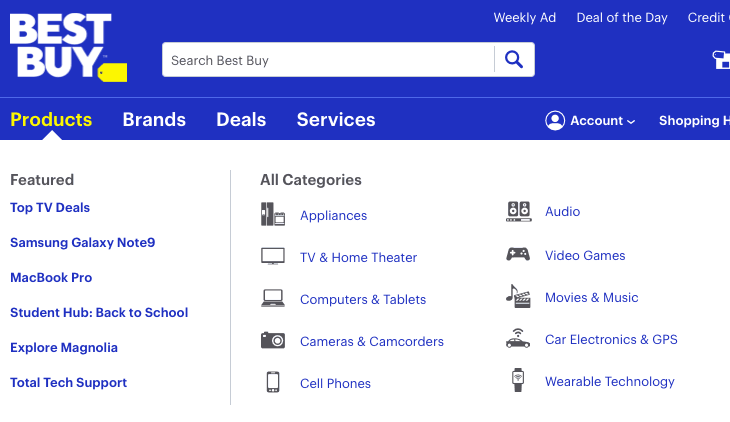
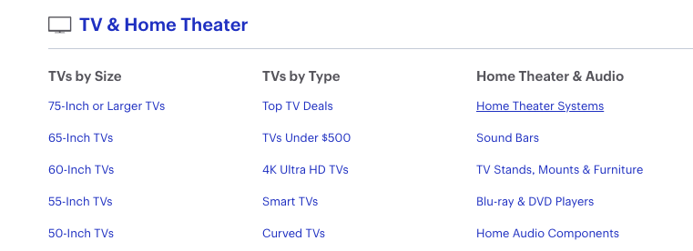
So why is it useful to show the same category under different parent categories?
According to a Measuring Usability study, listing items under various categories increased the percentage of users who successfully locate a particular item in a children's furniture store from 29% to 74%. That said, improving product visibility always increases the likelihood of sales.
2. Create scannable content
Many web visitors who shop online don't want to read through long passages of text. In fact, users only read 20% of the text on a webpage on average. As such, you should format content in a way that allows people to quickly locate the information they need so you can convert them before they lose interest.
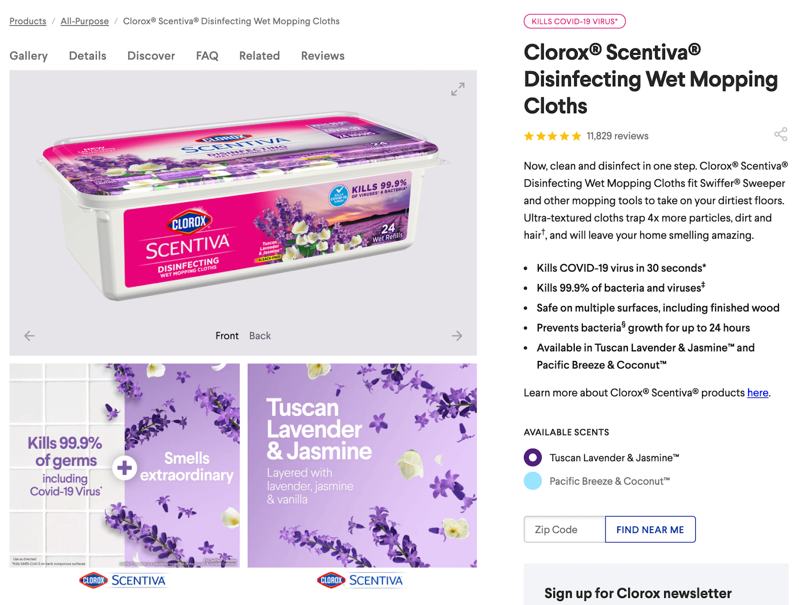
Look at how the product description for Clorox explains the product's nature and benefits right at the top of the page. In order to convey succinct, scannable benefits, the brand uses bullet lists.
The rule of thumb here is don't overwhelm your audience with text. Deliver your message in a readable, scannable format through the following:
- Use bullet lists, especially when describing a product's features or benefits.
- Highlight keywords to make it easier for customers to find your products.
- Write short sentences and relevant phrases to communicate your ideas clearly.
3. Display eye-catching product images
A good Ecommerce website requires eye-catching product images that draw customers’ attention. Online shoppers quickly form opinions based on what they see, so making a good first impression will benefit your business.
Pay attention to colors, sizes, and designs in your product photos. Clients want to know if a product will live up to their expectations, so you want product photos that represent the actual thing as accurately as possible.
Take a look at Naturebox. They use product photography and product photo editing to present products in a more natural setting so customers get a better glimpse of what to expect. By arranging their food in a setting that resembles how customers would enjoy them at home instead of showing pictures of the food packaging, Naturebox is better able to appeal to a relevant audience who is interested in their delicious premium products.

4. Provide compelling call-to-actions (CTAs)
To increase the number of website visitors who take action, you must learn to control visitor attention, elicit a sense of urgency, and present a good. Having compelling CTAs can help you with this.
CTA is a text conveying a clear desired action, targeted towards a particular audience. To make CTA compelling, you want to highlight it and make sure your audience notices it.
Wherever you are in the Ecommerce funnel—product view, add to cart, and checkout— always use only one CTA at a time. Two or more CTAs on the same web page will compete for a potential customer’s attention, make your web page intention vague and overwhelming, and decrease the chances of the customer acting on any CTAs displayed.
Additionally, there is power in repetition. Showing your primary CTA at the top and the bottom of a page may help improve conversions.
And it always pays to draw attention to your CTA. If you want the customer to click a button, redesigning the button itself to make it bigger, give it more space, and make it impossible to ignore increases the likelihood of people clicking it.
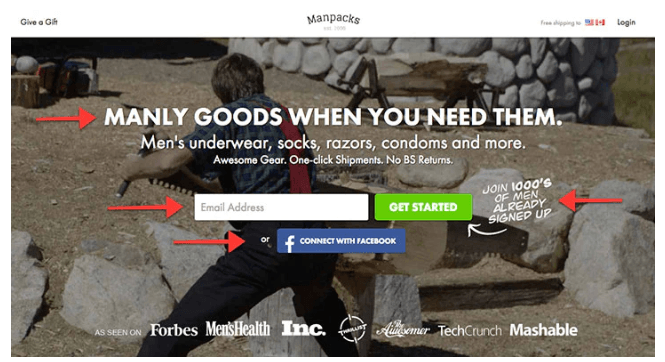
One of the best call-to-actions (CTAs) that encourages clicks is seen on the Manpacks landing page. Their primary CTA is prominently displayed above the fold in their hero section and is very easy to understand. Moreover, they provide a second option for people to more easily take action.
5. Build a mobile-friendly Ecommerce website
The UX on a mobile version of your e-commerce website shouldn’t be the same as on the desktop version. Your mobile page has to be sleeker, faster, and more user-friendly.
Responsive design must be integrated into your site to give your viewers the best experience, so your Ecommerce store adapts to the screen size of your customer’s device.
Besides offering a good customer experience, a mobile-friendly website is also essential to rank well in search results. Now that Google has switched to a mobile-first indexing system, mobile-friendly websites are no longer a good thing to have, they are basically a requirement.
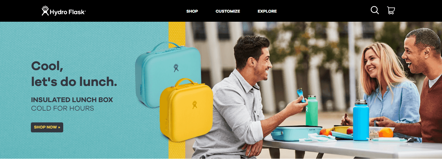
Check out this responsive design from HydroFlask! Here’s how their website looks when viewed on a desktop version.
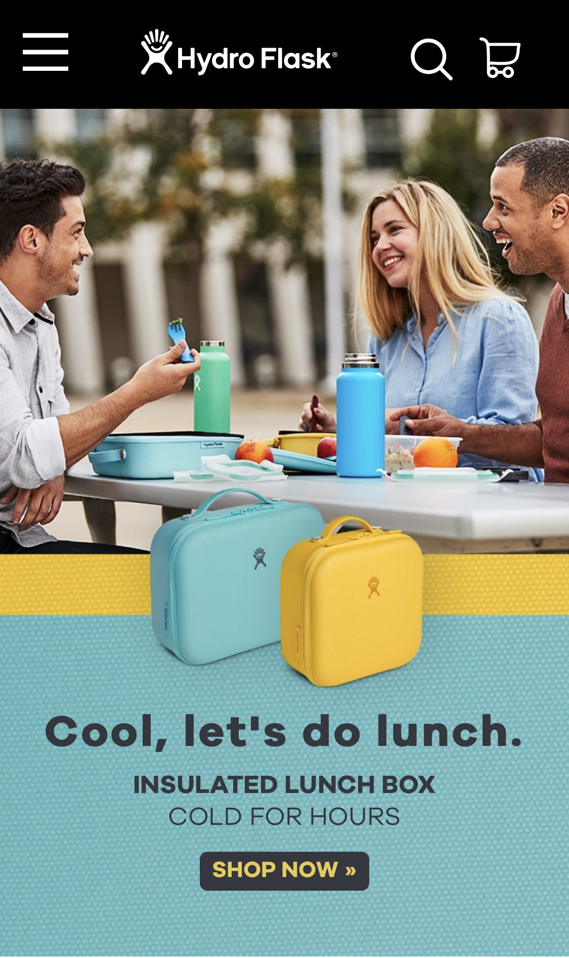
Here is the same website when viewed on a mobile device. As you can see, the website seamlessly scales to a smaller screen to deliver the same experience.
6. Maintain consistent color palettes
Designing an Ecommerce site that follows a consistent color palette can achieve two goals: boost conversion and forge a solid brand identity.
In the context of brand identity, color can be used to communicate meaning or information about the brand as well as establish consistency and cohesiveness among various products on the website.
By contrast, the use of accent colors to supplement primary colors is what facilitates conversion the greatest. Accent colors make strong directional indications and draw attention to particular products by using contrast, such as pointing at a page's CTAs and purchase buttons.
Prior to designing other marketing collaterals, you must have a clear color palette first. Choose a color scheme that draws attention and speeds up conversions based on your target market, products, and value proposition.
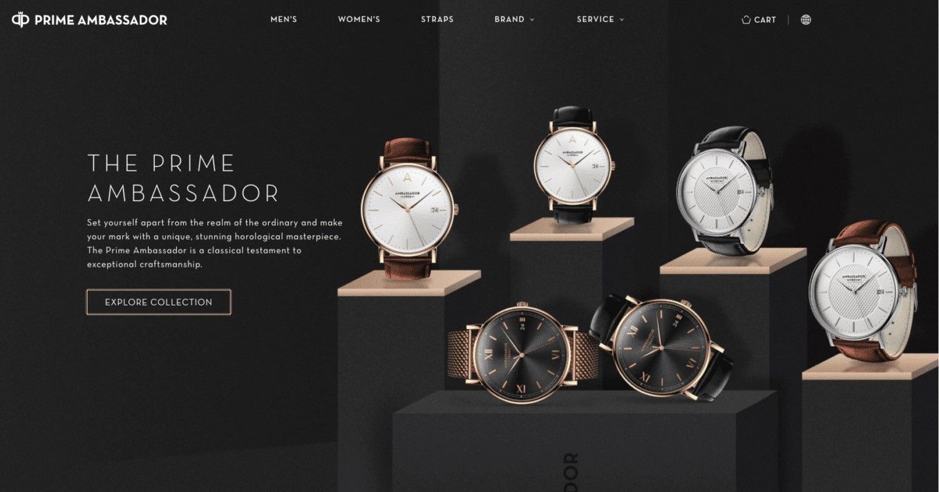
Consider Prime Ambassador, a Swedish manufacturer of watches with a chic online store created to showcase the products. The image's color scheme of an almost golden light brown shade on a dark gray background and wooden accents gives the viewer a sense of sophistication and luxury.
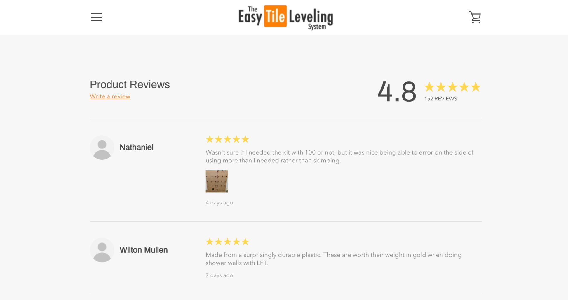
7. Include customer reviews
You might be surprised to learn that 54.7% of customers check at least four customer reviews before making a purchase. Customer reviews secure the customer journey by giving online shoppers the confidence to complete the checkout process.
Because they reflect unbiased, first-hand user experiences, reviews are effective in gaining customers' trust. They are unique pieces of content that search engines love since they are written by customers. Naturally, a lot of positive customer reviews will increase organic traffic to an Ecommerce website.
Making your product reviews page a seamless addition to your Ecommerce website is one of the best ecommerce design tips you can follow. Take a look at this product review page from The Easy Tile Leveling System. They customized their product review page to match their store’s theme. Also, the reviews are very thorough, and some customers include a photo to confirm they have purchased from the store.
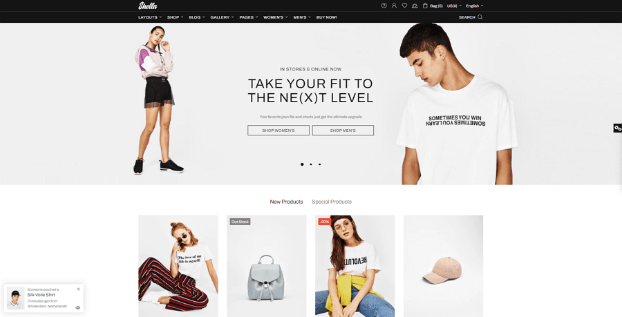
8. Use grid style layouts
Grid style is the best layout for Ecommerce stores from a graphics and web design standpoint because it arranges items in your product catalog in rows and columns to help users explore your products.
Grid-style layouts give web design structure and hierarchy, making the website easier to navigate and information more convenient to locate, which are hallmarks of a positive user experience.
When using grid-style layouts, have no more than three to four products to avoid cording your catalog and overwhelming the customer. Additionally, leave lots of white space surrounding each item so that customers can easily distinguish products from one another.
Below is an example of a product catalog that balances whitespaces. Shella’s store utilizes spacing between sections to allow shoppers to breathe and pause as they scroll through the website.
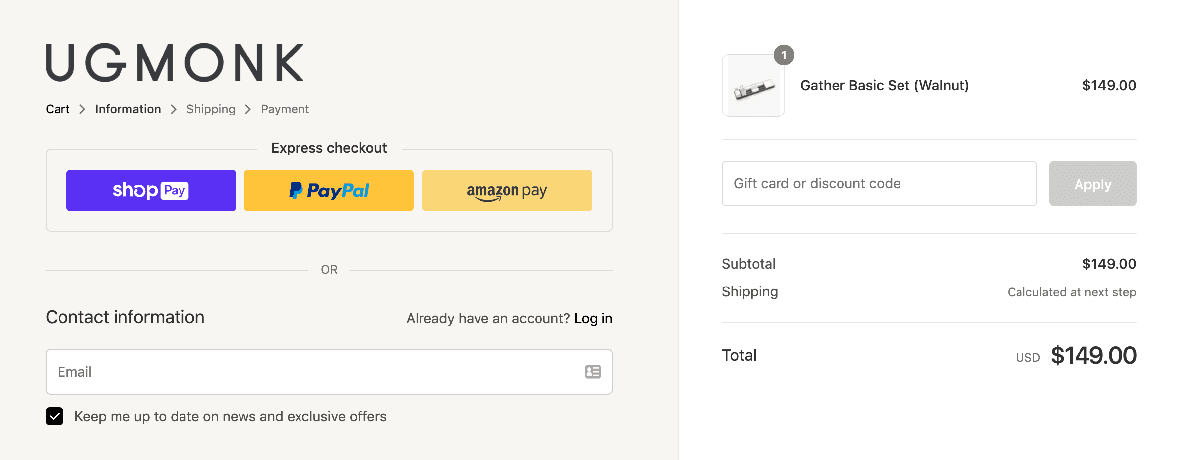
9. Show trust badges
With tons of fake websites and phishing scams reported recently, customers have become reasonably apprehensive about sharing their credit card information. To build trust and credibility on your website, you ought to display trust badges.
Trust badges are seals of legitimacy used by websites to reassure visitors that your Ecommerce store is real. Trust symbols such as "Paypal-verified" or "Secured Checkout" reassure shoppers and help motivate them to purchase from your store.
In fact, trust badges should appear on all pages, not only on product and category pages. Use this example from Ugmonk to see how you can apply trust badges on checkout pages to help reduce cart abandonment:
10. Ensure accuracy of product information
Make sure you only provide correct information, no matter what your web visitors and customers are looking for in your Ecommerce website. Your product data entry must be accurate at all times, and contain product-relevant information including but not limited to the:
- Product cost
- Type of product
- Product titles and descriptions
- Availability
- Product imagery, videos, and other media
- Shipping data such as cost and date
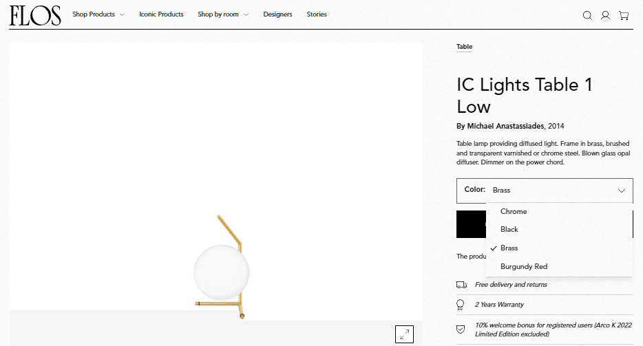
FLOS, for example, has provided accurate information that helps shoppers envision the product in their environment. This helps customers better realize the value of the product, encouraging sales.
Here are the product data FLOS included on their website:
- Details of product delivery and warranty information
- The designer calls out to speak to the value proposition
- Color customization options and payment methods
- Easy-to-understand product description
Implement Ecommerce Design Tips: Outsource Graphic Design Services to the Philippines
Low conversion rates on Ecommerce websites are often not just a design issue, but also a reflection of customer service quality. Exceptional customer service is key to improving user experience and driving sales, so start with outsourcing customer care.
ManilaPros is the top choice when it comes to getting five-star customer care for retailers. We're a full-service company that transform your customer interactions into memorable experiences through customer service Pros who have undergone rigorous on-brand training and certification.
Book a call today to get started!